
Communication concept Sto facade system
Our ambition has been to develop a concept for Sto's facade system that is flexible, easy to identify and that distinguishes Sto from its competitors through a modern and elegant design language. It should appeal to both architects and building consultants while creating interest and presenting Sto as the innovative and qualitative alternative.
For the concept, we have drawn inspiration from the architect's form and sketchy lines, as well as from the designer's drawings and construction plans, etc.
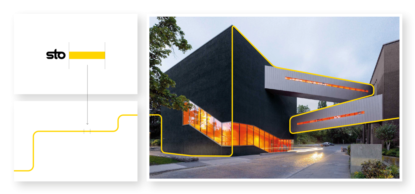
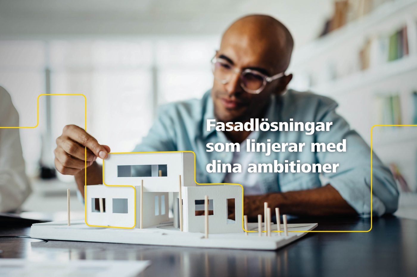
Based on the idea of a line, we have created a visual marker, inspired by the yellow element in the Sto logo. By combining the yellow line with striking images linked to architecture and construction, a cohesive marker for the concept is created. The line is used to dramatize and focus the imagery and link it to the message in a clear way.
The concept is based on the idea that Sto facade systems enhance construction and design solutions in several different ways, which can appeal to both building consultants and architects. By communicating that Sto has chosen its own line, we distinguish the company's solutions from those of its competitors.
In the world of building consultancy, the line represents construction drawings and guidelines. In architecture, the line of the building or façade is a concept. The line is therefore used to encircle the concept and capture the attention of the building consultant and architect.
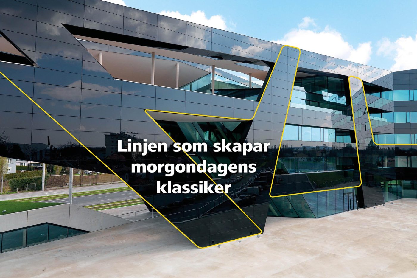
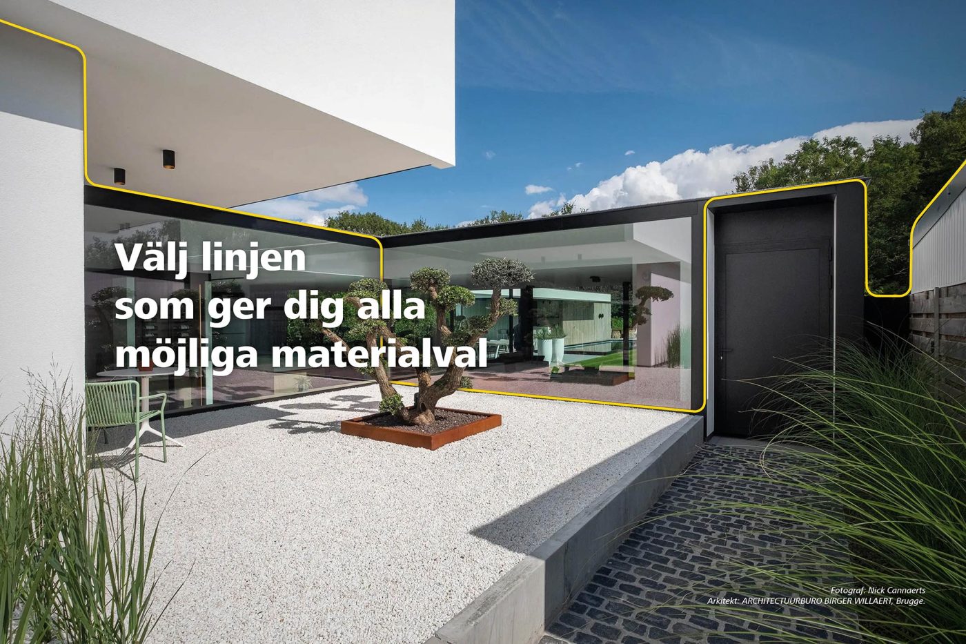
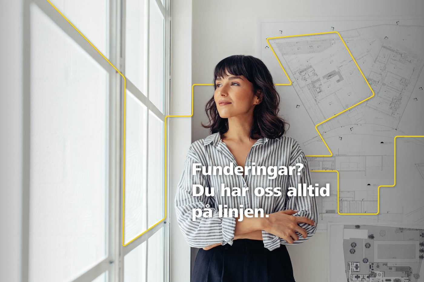
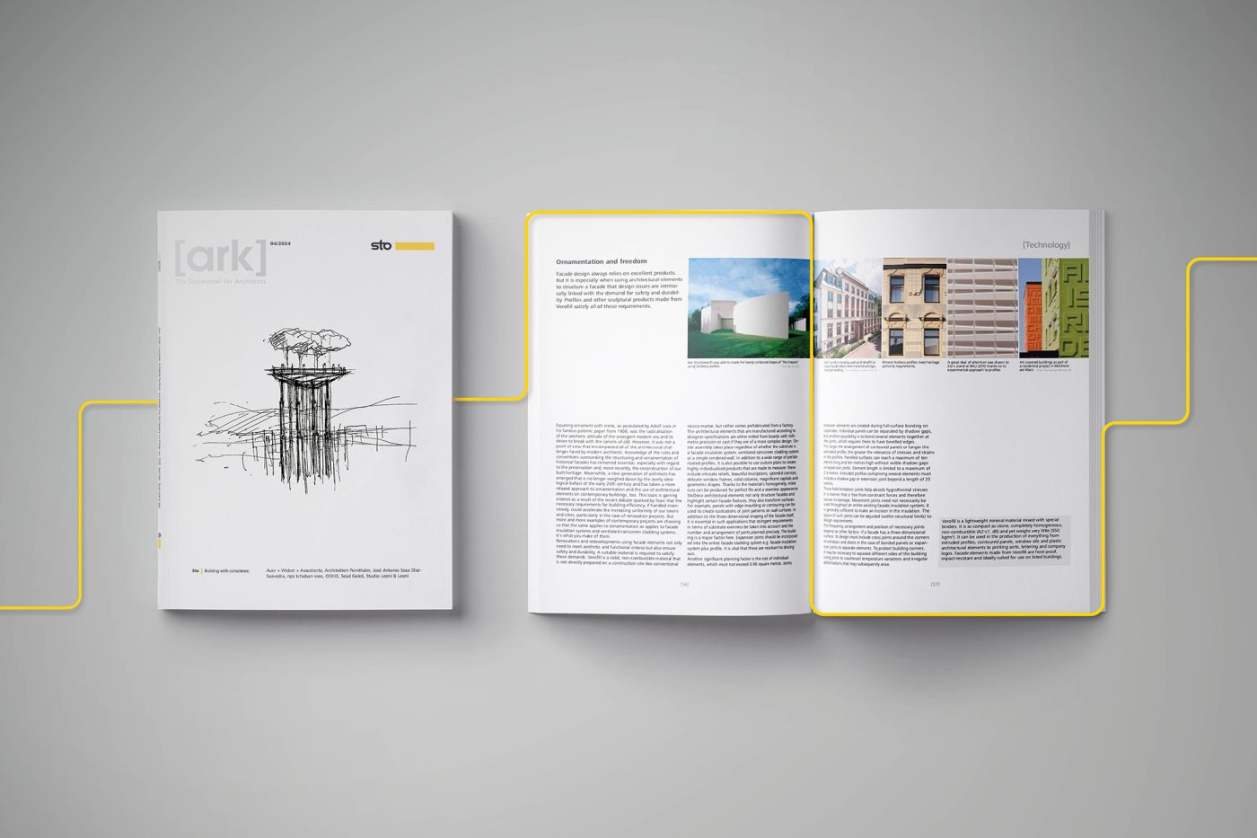
"The line that lifts" is also used literally as a visual marker, tying text and image together in a way that lifts the whole. It is scalable and sustainable, while creating great flexibility, and shows that Sto is a company at the innovative forefront.
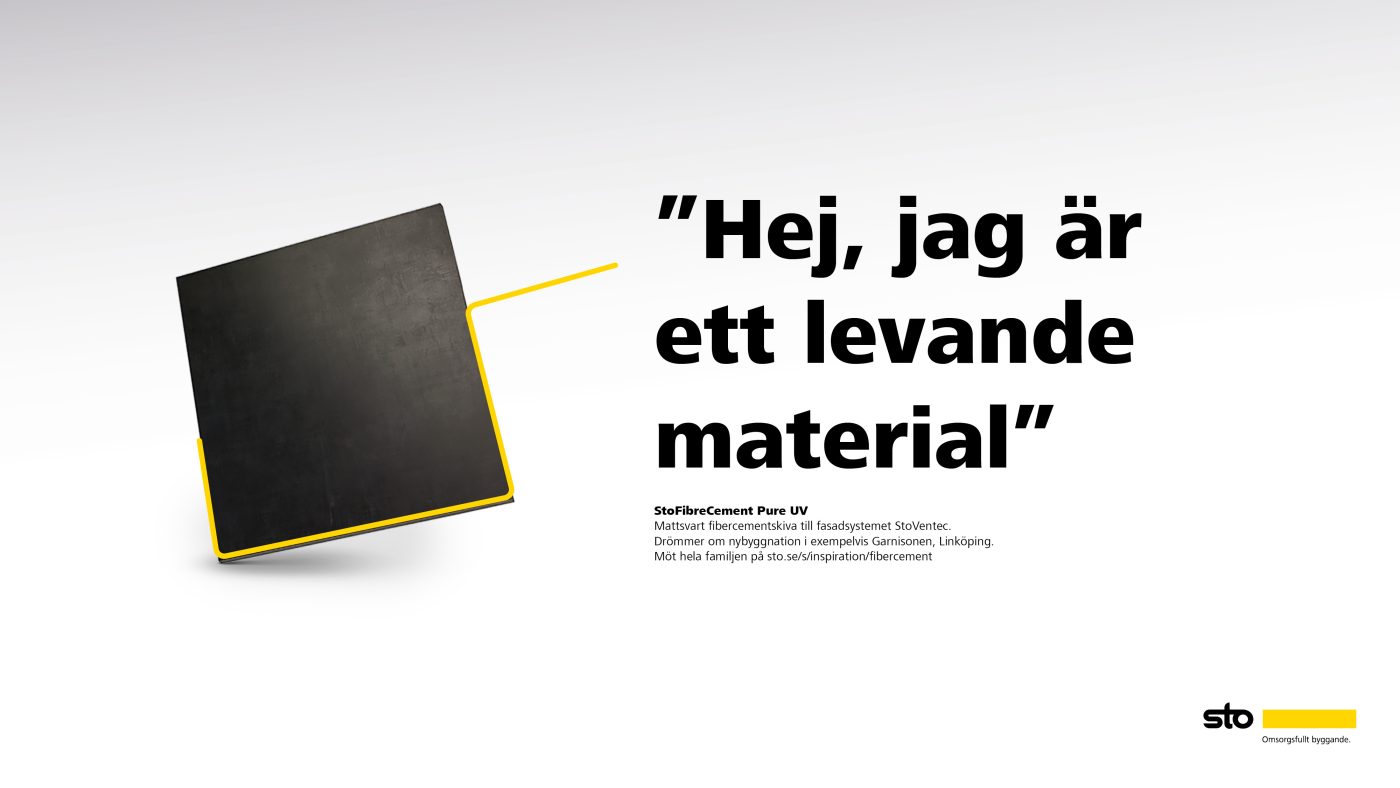
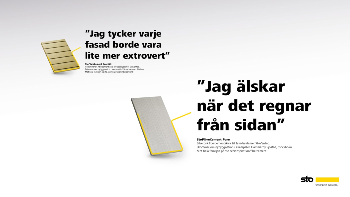
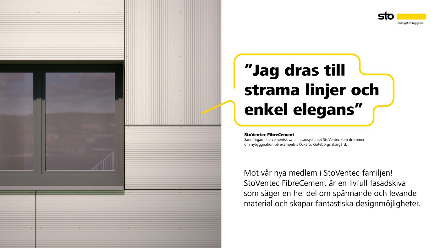
Kampanjkoncept - Den livfulla och färgstarka familjen av fibercementskivor
Det finns konkurrenter som sedan tidigare har lanserat fibercement- skivor på den svenska marknaden. Eftersom Sto inte är först blir det viktigt att hitta sätt att sticka ut och skapa uppmärksamhet. Det kräver att vi tar ut svängarna och bryter av mot hur reklam för byggnadsmaterial traditionellt ser ut. Vi har utgått från budskapshusets huvudbudskap ”Vi utökar StoVentec-familjen med ett sortiment av livfulla fibercement- skivor” och skapat ett kampanjkoncept utifrån detta.
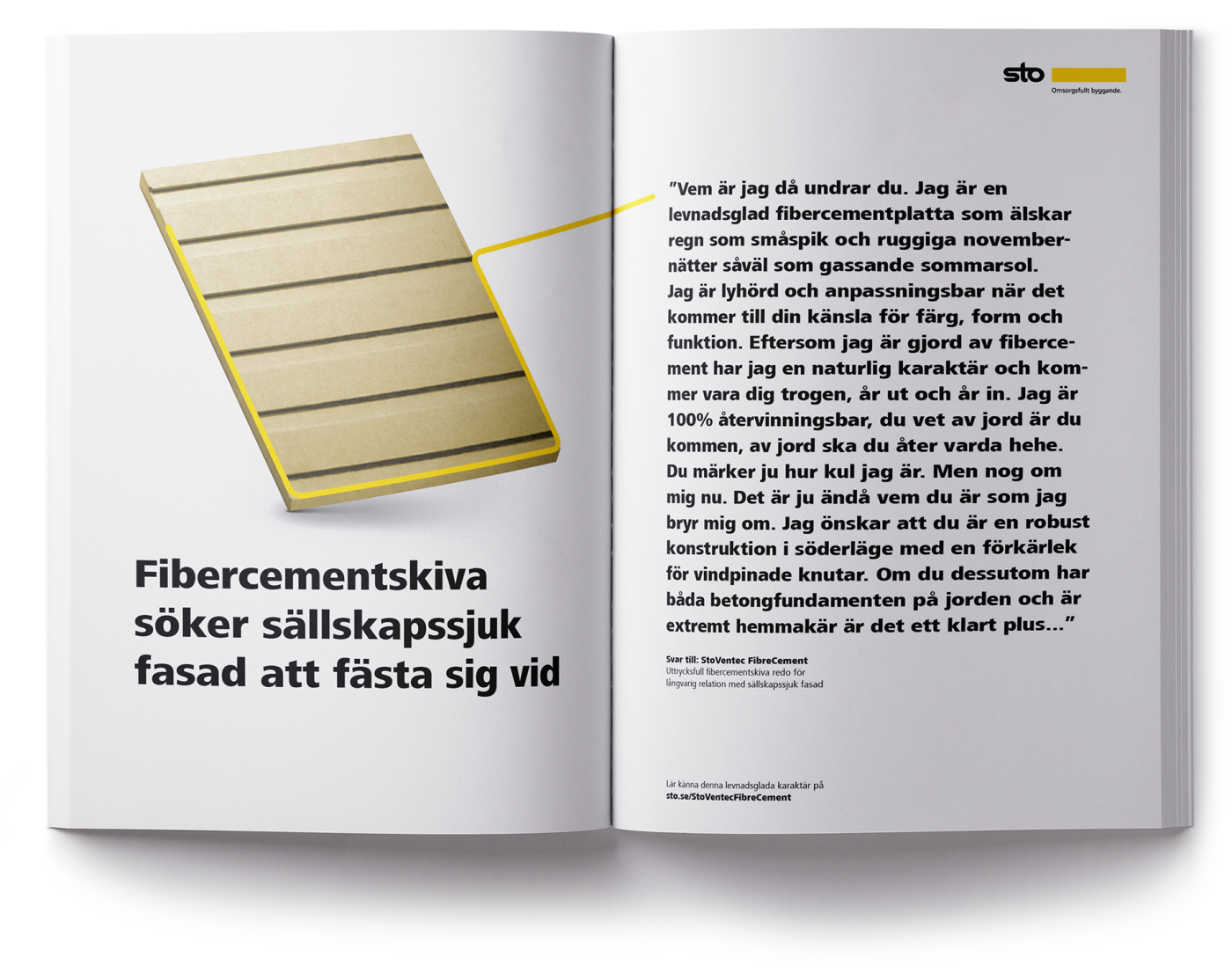
Kontaktannons
Målgrupp: Arkitekter och byggkonsulter
Placering: Branschspecifika tidningar
Syfte: Kontaktannonsen är en idé som kombinerar rationella produktfördelar med den lättsamma tonen i det övergripande kommunikationskonceptet. Inspirerade av traditionella kontaktannonser i tidningar skriver vi copy som lyfter viktiga aspekter för respektive målgrupp som vi adresserar.
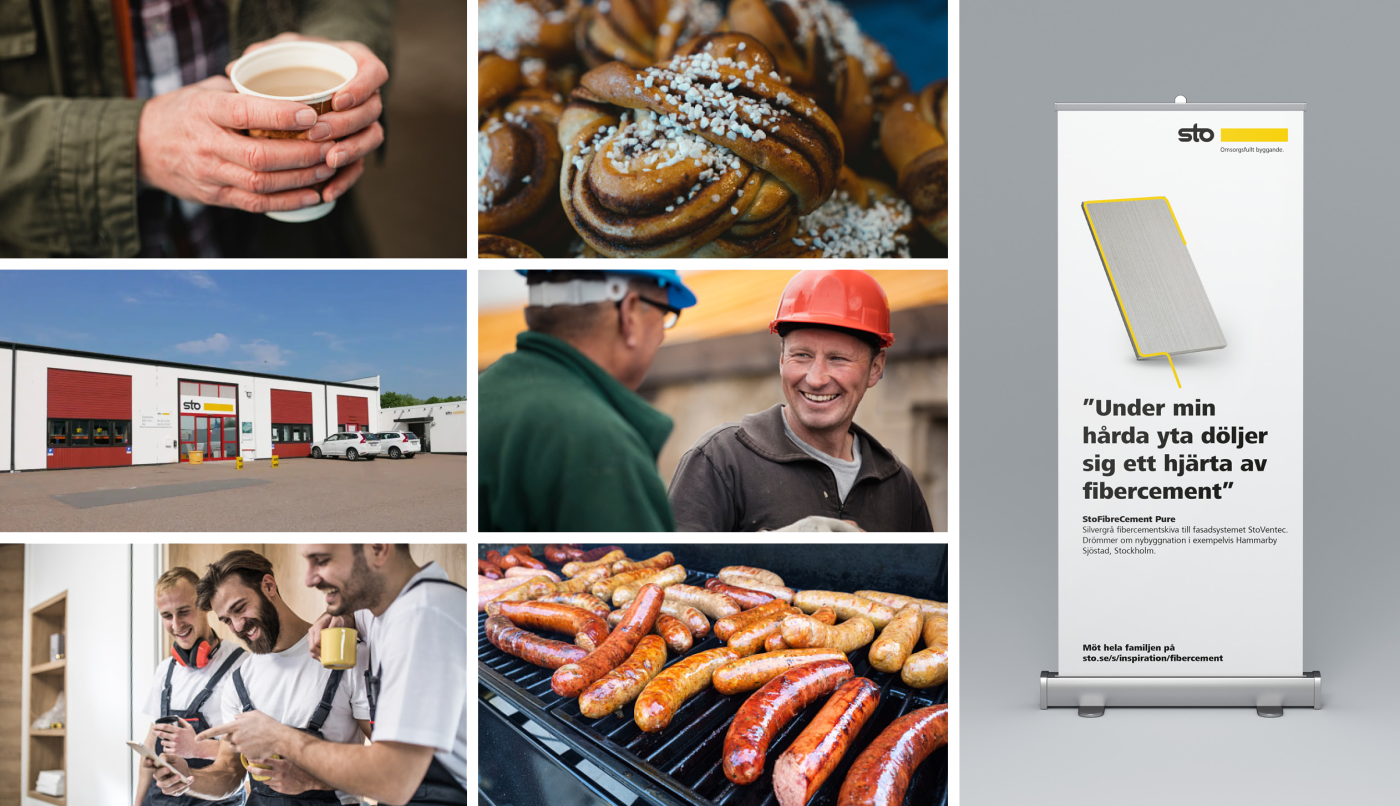
Aktivering för entreprenörer - StoCenter bjuder på snackisar
Gofika med exempelvis vetelängd, kaffe, musik etc eller ”snackbar” med byggarlunch. Det senaste snacket från branschen och StoVentecs ”bästa sägningar” i StoCenter showroom.
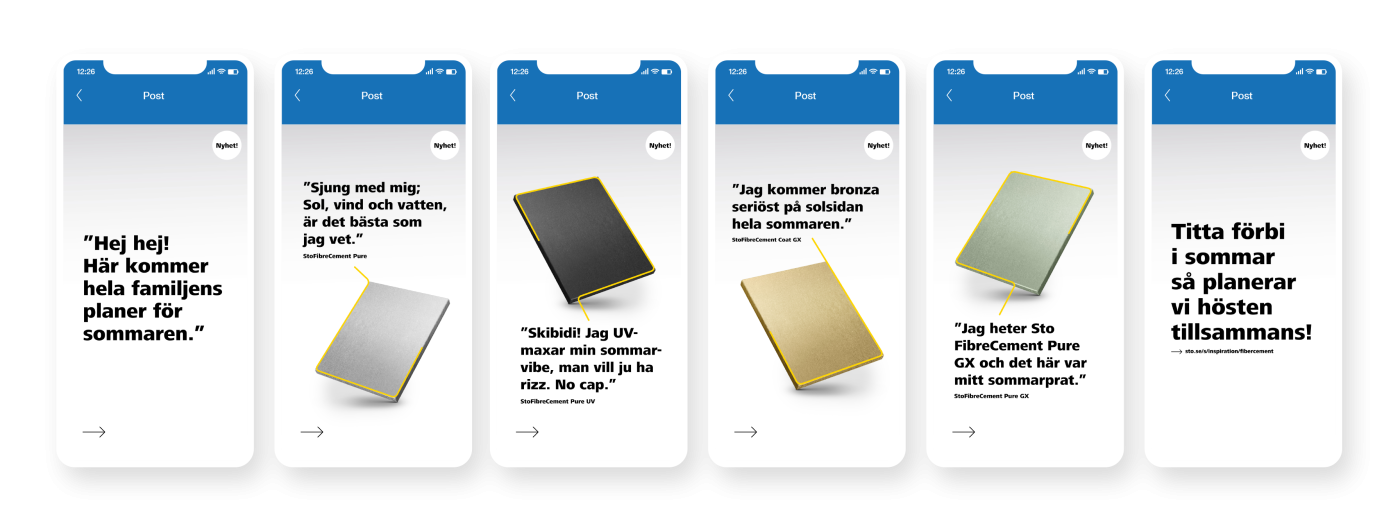
Annonsering i digitala kanaler
Kampanjen har presterat mycket bra då den både genererat bra synlighet och högt engagemang.
Related cases